
Última actualización: 4 de noviembre de 2026
Resumen rápido
Match kitchen countertops with cabinet colors by comparing undertones rather than shade, since warm and cool tints decide whether a pairing looks intentional or clashing. Hold both samples side by side against plain white paper, then check them under your home lighting before you commit.
- Undertones matter more than shade, so compare warm and cool tints side by side.
- Place both samples against plain white paper to reveal hidden undertones.
- Decide first whether you want the countertop to contrast with the cabinets or coordinate with them.
- Check samples at home in morning, midday, and night light, since lighting shifts color.
- Quartz needs no sealing but resin can scorch, so use trivets; granite needs periodic sealing.
Índice
- Why Undertones Matter More Than Shade When Matching Kitchen Countertops
- Step 1: Decide Between Contrast and Coordination
- Step 2: Check Your Kitchen Lighting Before You Commit
- Best Countertop Materials for Kitchens and How They Pair With Cabinets
- Kitchen Cabinet and Countertop Color Combinations That Work
- Step 5: Match Kitchen Flooring to Cabinets and Countertops
- Planning Your Kitchen Color Pairing for Your Budget and Household
- Bring Your Samples to Viva Floors & More and Request an Estimate
- Preguntas frecuentes
Why Undertones Matter More Than Shade When Matching Kitchen Countertops
Most homeowners start with shade. They hold a cabinet sample next to one of the kitchen countertops options and ask whether the colors look close. Undertones decide whether a pairing feels calm or clashing, and two colors that look identical in the showroom can drift apart once they reach your kitchen.
Undertones are the faint warm or cool tint sitting beneath a color. Beige can lean yellow, pink, or gray. White can lean creamy or blue. When the undertones match, the pairing looks intentional. When they clash, the kitchen looks mismatched even if both surfaces are technically “white.”
A good test is to place both samples side by side against a plain white sheet of paper. The paper acts as a neutral reference, so warm and cool tints stand out clearly.
- Warm undertones: yellow, peach, red, or golden tints
- Cool undertones: blue, gray, green, or silver tints
- Neutral undertones: balanced, with no obvious lean
Keep undertones consistent across the room. A warm cabinet paired with a cool countertop often looks unfinished, even when each piece looks fine alone.
Step 1: Decide Between Contrast and Coordination
The first real decision is whether you want the countertop and cabinets to stand apart or blend together. Contrast creates a bold, defined look. Coordination creates a softer, more unified room.
Contrast works well when you want the counter to act as a focal point. A dark quartz counter over white shaker cabinets is a common example. Coordination works better in smaller kitchens, where too many strong edges can make the space feel crowded.
Ask yourself one question: do you want the eye to stop at the counter, or move smoothly across the room? Your answer points you toward one approach.
Watch out: Mixing high contrast with busy backsplash tile often overwhelms the room. Pick one area to be the focal point and keep the rest calm.
Step 2: Check Your Kitchen Lighting Before You Commit
Lighting changes color more than most people expect. A sample that looks warm in a bright showroom can turn gray under cool LED bulbs at home. North-facing windows also cast cooler light all day, which shifts warm tones toward muddy beige.
Take your samples home before you decide. Look at them in the morning, at midday, and under your kitchen lights at night. Note how each sample changes.
Lighting temperature is measured in Kelvin (Understanding LED Color-Tunable Products). Warm bulbs typically fall around 2700K to 3000K, while daylight bulbs sit higher (Understanding LED Color-Tunable Products). Matching your bulb temperature to your sample choices is one of the simplest ways to avoid surprises.
Best Countertop Materials for Kitchens and How They Pair With Cabinets
Material affects color as much as paint does. A heavily veined granite reads very differently from a solid quartz with a matte finish, even when both share the same base shade. The material also decides how that color ages, how much upkeep it demands, and how forgiving it is in a busy household. That practical side is where most pairing guides stop short.
Quartz. Engineered quartz blends ground stone with resin, so the pattern is consistent from slab to slab. Because quartz’s consistent pattern makes color coordination easier, carry the same care into nearby details and match grout with tiles so the whole kitchen feels cohesive.
Granite. Natural granite brings variation and visible veining that works well with warm wood or neutral cabinets. Because every slab is different, bring the actual slab sample, not a small chip, to your cabinet door. Granite is generally considered heat-resistant and durable, but it is porous and typically needs periodic sealing. Dark granite hides stains but shows dust and fingerprints; light granite shows oil and wine spills.
Marble. Marble offers soft veining and a luxurious look, and it pairs naturally with white, cream, and soft gray cabinets. Before committing, check the ongoing upkeep marble requires. It is also the most demanding surface on this list: marble is softer than granite or quartz, etches from acidic foods and cleaners, and needs regular sealing.
Porcelain. Porcelain slabs are thin, durable, and available in matte and high-gloss finishes that mimic stone or concrete. Porcelain is commonly described as resistant to stains, heat, and scratches. Its pattern is printed and repeatable, though the edge profile is more limited than with stone.
Soapstone and butcher block. Soapstone is non-porous and develops a patina over time, which suits dark, moody cabinet colors. Butcher block warms up white and gray kitchens but requires oiling and shows knife marks. Both are worth considering when the cabinet color is the star and you want the counter to stay quiet.
Finish matters as much as material. A high-gloss cabinet next to a matte counter can look sharp and deliberate, while two glossy surfaces can create glare in a bright room. A common pattern is to let one surface carry the sheen and keep the other matte.
Watch out: pairing a heavily veined natural stone with a busy backsplash and a patterned floor leaves no quiet surface, and the room starts to feel chaotic regardless of how well the colors match.
The article compares common countertop materials by how they resist wear, need upkeep, and pair with cabinets.
| Material | Upkeep | Key trade-off |
|---|---|---|
| Quartz | No sealing needed | Resin can scorch; use trivets |
| Granite | Periodic sealing | Porous; needs care |
| Marble | Regular sealing | Etches from acidic foods |
| Porcelain | Low maintenance | Limited edge profiles |
| Soapstone | Non-porous | Develops patina over time |
| Butcher block | Regular oiling | Shows knife marks |
Kitchen Cabinet and Countertop Color Combinations That Work
Some pairings have proven reliable across many kitchens. Use these as starting points, then adjust for undertones, lighting, and the two factors most guides ignore: the size of the room and the metal finishes you plan to use.
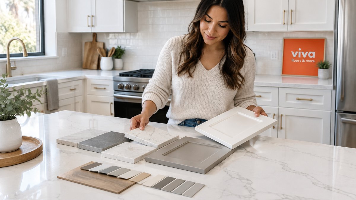
- White shaker cabinets with light gray quartz and soft veining
- Warm wood or stained cabinets with creamy granite
- Navy or deep green cabinets with white or pale marble-look quartz
- Gray cabinets with warm beige or taupe countertops for a soft, layered look
- Black or charcoal cabinets with a white quartz and a warm wood floor to keep the room from going flat
A monochromatic scheme uses different shades of one color family, such as taupe cabinets and a slightly darker taupe counter. It feels calm and cohesive, though it can look flat without texture. Complementary colors sit opposite each other on the color wheel; a deep green cabinet with a warm red-toned granite is one example. Use those pairings carefully, since strong complementary colors compete for attention.
Small kitchens. In a compact kitchen, high contrast between cabinets and counters can chop the room into visual bands and make it feel tighter. A common pattern is to keep the cabinet and counter within a few shades of each other, then add contrast through the backsplash or hardware. Light counters and light cabinets bounce more light around a small room, which matters in galley layouts and basements with limited windows.
Large kitchens. Big rooms can absorb stronger contrast and darker surfaces. A dark quartz or soapstone counter over white perimeter cabinets gives a large kitchen a focal point without closing it in. In open-plan spaces, repeat one color from the kitchen into the adjoining room so the palette does not stop at the doorway.
Hardware and fixture integration. The metal finish is the third color in the room, and it changes how the cabinet and counter read together. Warm metals such as brushed gold, brass, and copper flatter cream, warm white, and wood-tone cabinets and pull warm undertones out of granite and quartz. Cool metals such as brushed nickel, chrome, and stainless steel sit naturally with gray, blue, and cool white palettes. Matte black hardware adds definition against white or light gray cabinets and pairs well with a dark counter or a dark island.
Backsplash and floor as the tie-breaker. When the cabinet and counter sit close in tone, the backsplash and floor decide whether the room reads warm or cool. A warm wood floor can soften a cool gray kitchen, and a cool gray plank floor can calm a room with warm cabinets. Let at least one surface stay quiet so the eye has somewhere to rest.
Watch out: choosing hardware after the cabinets and counters are installed often forces a compromise, because the metal finish can shift how warm or cool the whole pairing looks.
Step 5: Match Kitchen Flooring to Cabinets and Countertops
Flooring often gets chosen last, yet it covers a large part of the visual field. Aim to coordinate the flooring with the cabinet or counter undertones rather than matching exact shades.
A light oak or warm vinyl floor can soften a cool gray kitchen. A cool gray plank floor can calm a room with warm cabinets. Check the flooring in the same room light as your countertop sample, since both shift under different bulbs.
Matte finishes on flooring tend to hide scratches and dust better than high-gloss options. That matters most in busy households.
Watch out: Pairing a busy patterned floor with a veined countertop and patterned backsplash can make the kitchen feel chaotic. Let at least one surface stay quiet.
Planning Your Kitchen Color Pairing for Your Budget and Household
Your budget and daily use should shape the final choice. Quartz and porcelain often suit busy households because they resist stains and scratches. Natural stone can look stunning, but it asks for more care.
Think about who uses the kitchen. Families with young children may prefer a darker, forgiving counter that hides crumbs and smudges. Homeowners who cook often may want a surface that handles heat, oil, and acidic foods well.
Before you buy, list your top three priorities. Common ones include stain resistance, low upkeep, resale appeal, and a specific look. Use that list to narrow your options quickly.
Plan a small test area too. A sample board on the counter for a week shows how the pairing works in daily life.
Bring Your Samples to Viva Floors & More and Request an Estimate
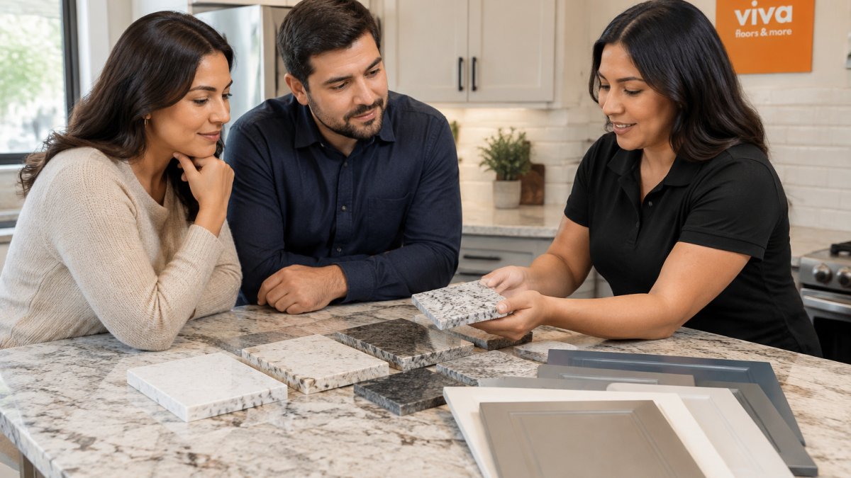
At Viva Floors & More, we recommend bringing your cabinet door sample, countertop slab sample, and any flooring pieces you are considering. Seeing them together, then comparing them at home, helps you judge the pairing before you commit.
Our team can help you think through undertones, finishes, and how each option fits your kitchen. Pricing depends on material, quantity, and delivery, so request an estimate for an accurate quote tailored to your project.
Preguntas frecuentes
Should countertops be lighter or darker than cabinets?
Either works, but the choice sets the tone. A lighter countertop than cabinets keeps the kitchen airy and makes dark cabinets feel less heavy. A darker countertop grounds light cabinets and adds contrast. Whichever direction you choose, keep the undertones consistent: warm cabinets pair best with warm stone, and cool gray or white cabinets with cool-toned surfaces. Bring physical samples home and check them in your own daylight before committing.
Does the countertop need to match the cabinets exactly?
No. Exact matches often look flat, and the countertop does not need to be identical to be harmonious. Coordination means sharing an undertone, a finish, or a value level while differing in pattern or shade. Matte or honed finishes pair well with painted cabinets, while high-gloss surfaces can compete with glossy doors. Bringing your samples to our showroom can help you judge the match before ordering.
What are the best countertop colors for white kitchen cabinets?
Soft whites, warm creams, light grays, and subtle beige quartz or granite are reliable choices for white cabinets. Pure bright white countertops can make white cabinets look dingy by comparison, so look for a slight tint that matches the cabinet undertone. Pale stone with gentle veining adds interest without overwhelming the cabinets. Pricing depends on material, quantity, and delivery, so request a current quote from Viva Floors & More for your specific selections.
